Money, made easier.
Project Type: Collaborative Project
Team: Nisha Sharma and Ashwani Tanwar

Managing money can feel fragmented.
Disconnected financial tasks
Payments, recurring expenses, and shared goals require entirely different interactions, making holistic financial management difficult.
Limited visibility into recurring costs
Users need a clearer view of subscription totals and upcoming charges, rather than relying on disparate emails or digging through transactions.
Numbers without context
Transaction data alone may not explain spending changes or possible next steps, leaving users with questions about their financial health.
Turning financial complexity into clarity.
Information overload
The home screen needs to communicate several types of financial information without competing for attention.
Establish a clear hierarchy: available balance, quick actions, Financial Health Score, subscriptions, Family Wallet, and recent transactions.
Recurring expenses are easy to overlook
Users need to understand both the total cost of subscriptions and when payments are due.
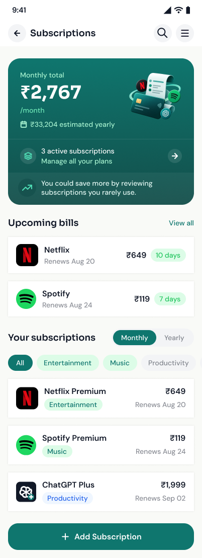
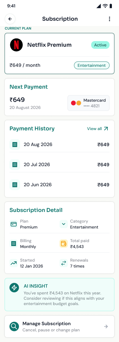
Create a dedicated Subscription Tracker showing monthly and annual totals, upcoming payments, service details, and management options.
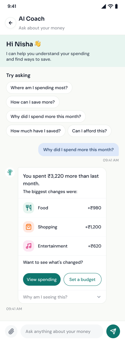
Spending data needs context
A spending figure is more useful when users can understand what changed and why.
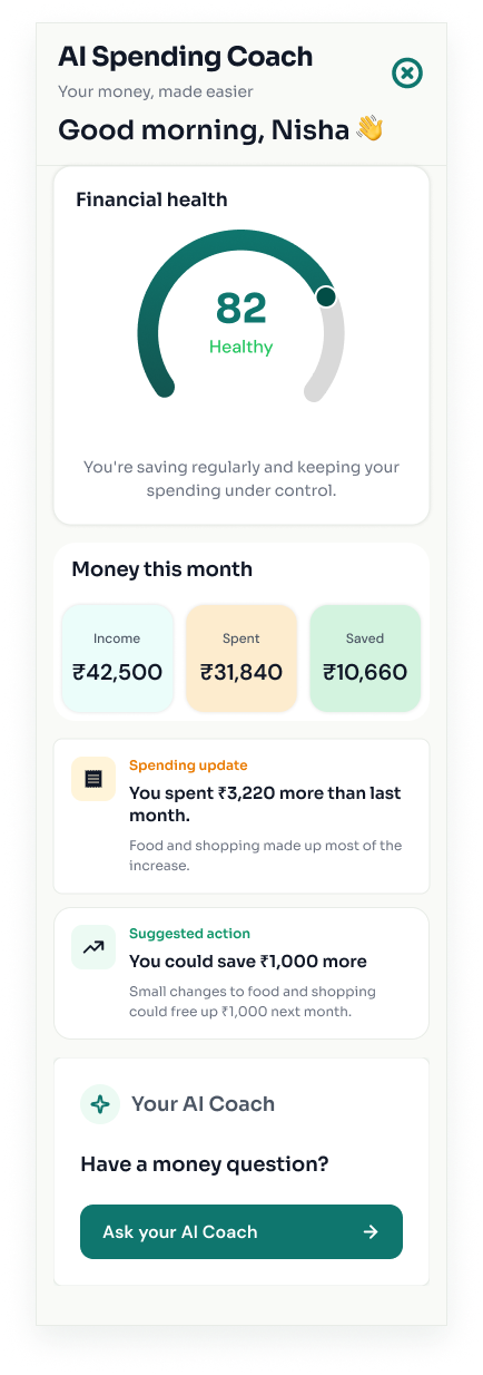
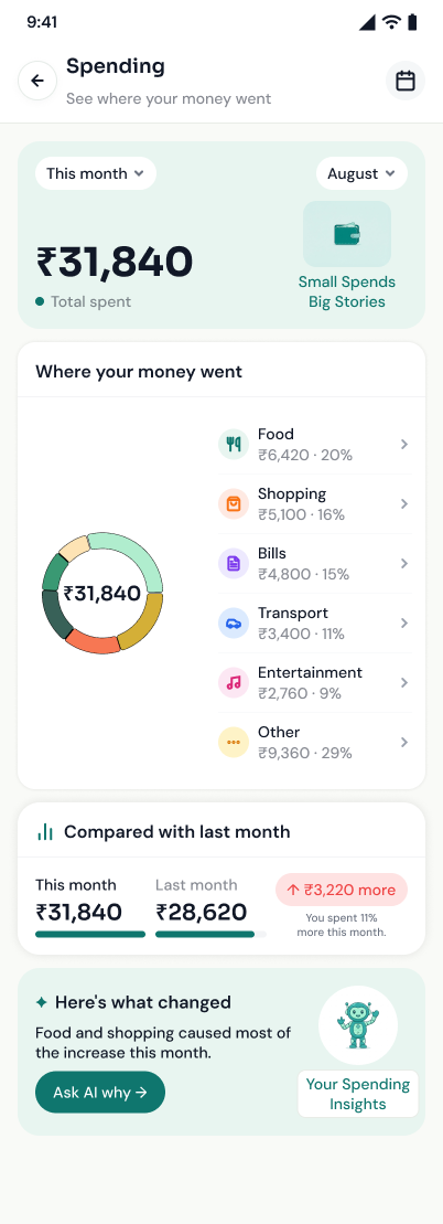
Design the AI Spending Coach around a monthly summary, spending updates, understandable explanations, and suggested actions.
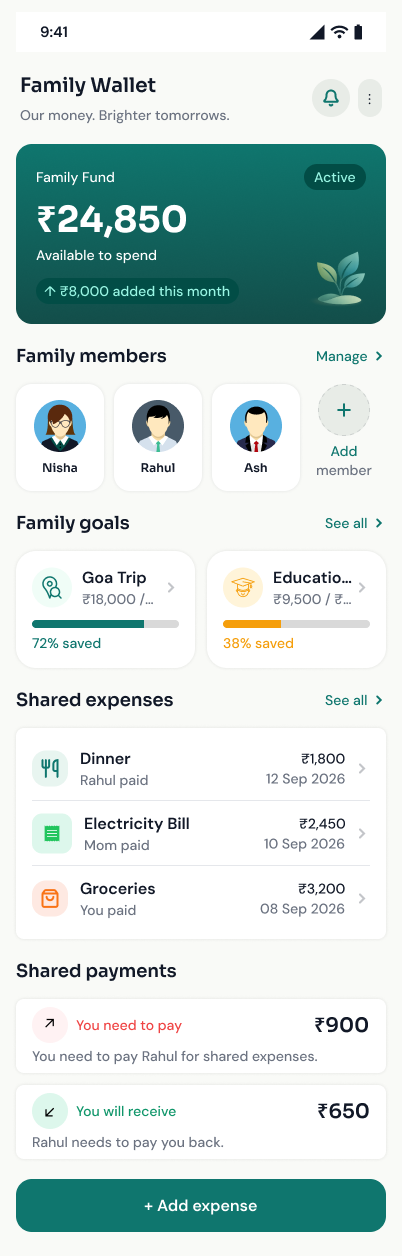
Shared finances need transparency
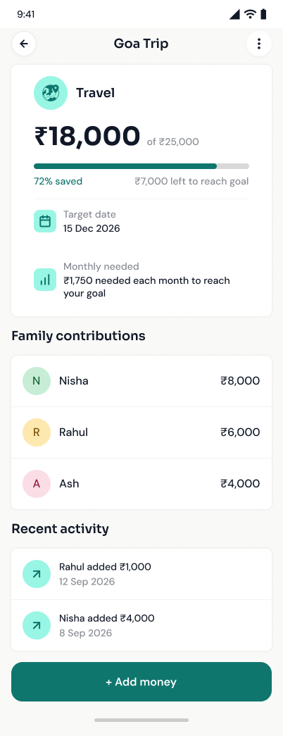
Users need to understand a shared goal and see how contributions affect progress.
Design the Family Wallet around the goal amount, current balance, member contributions, and recent activity.
Turning financial complexity into clarity
Information Architecture
Establishing a clear hierarchy on the home screen: available balance, quick actions, health score, and recent transactions without competing for attention.
Subscription Tracking
Creating a dedicated space that surfaces monthly and annual totals, upcoming payments, and quick management options to prevent overlooked expenses.
Contextual Insights
Designing the AI Spending Coach around a monthly summary, spending updates, and understandable explanations rather than raw data.
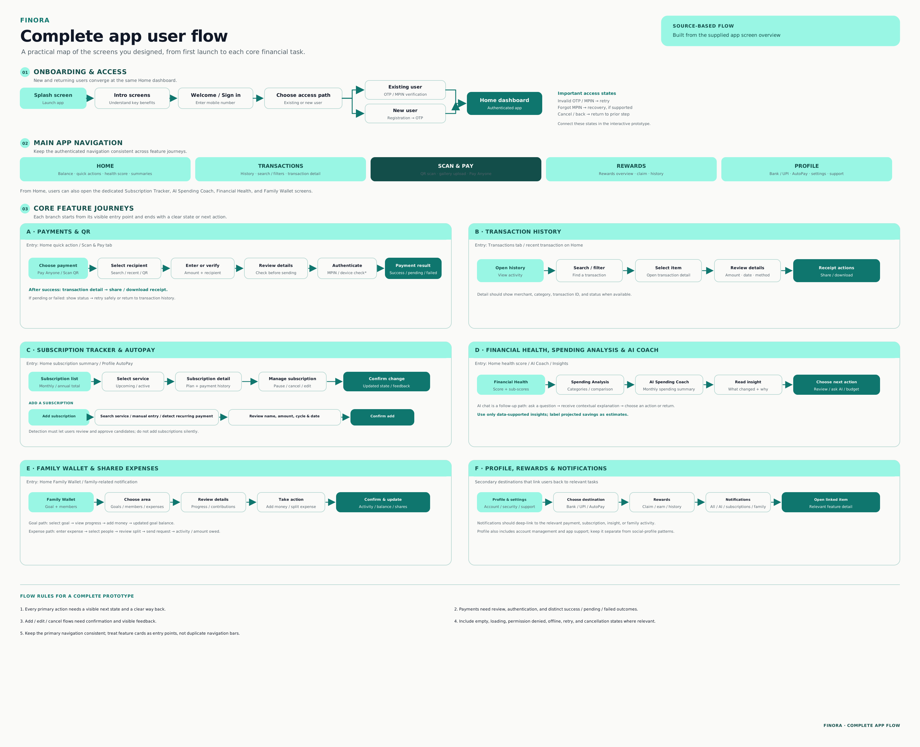
UX intent: keep the next step visible, show important details before confirmation, and provide a clear outcome after an action.
Typography
Aa
SoraAa
DM SansSora is selected for its distinctive, geometric character and strong visual hierarchy. It helps important headings and financial values feel clear and confident. DM Sans provides a clean, approachable appearance for everyday interface content.
Colors
From rough ideas to a considered structure.
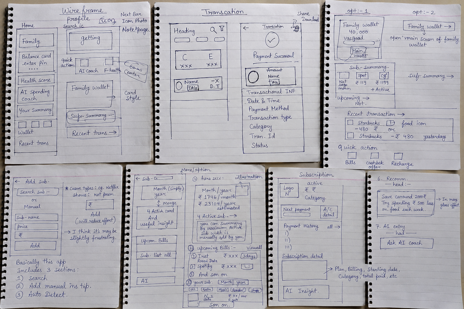
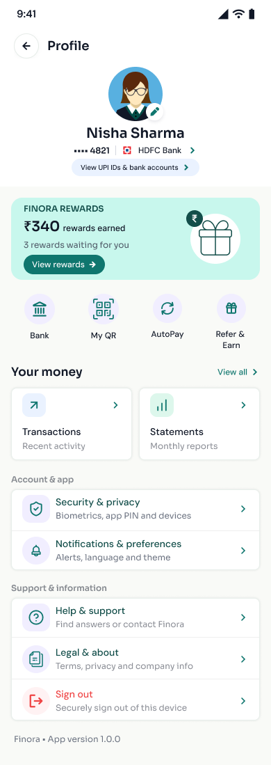
Everyday Banking
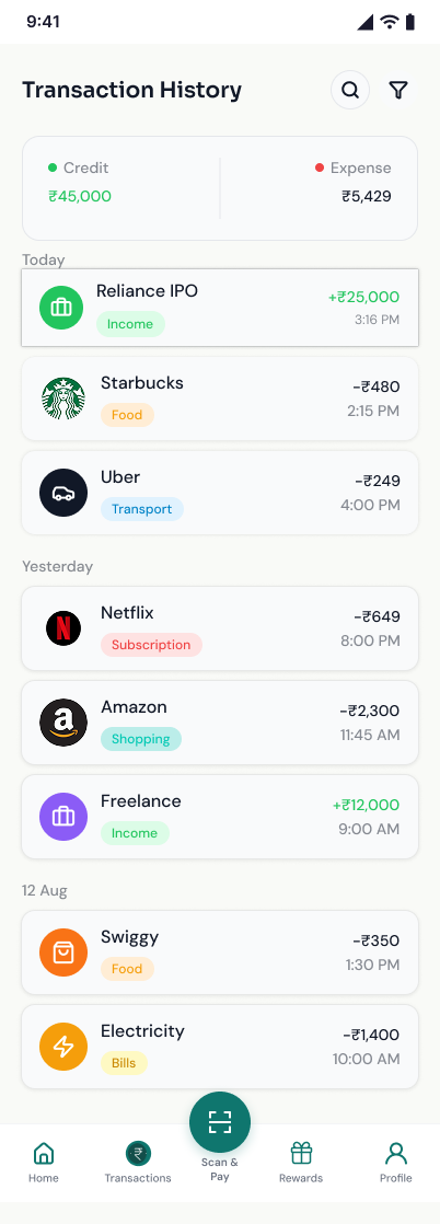
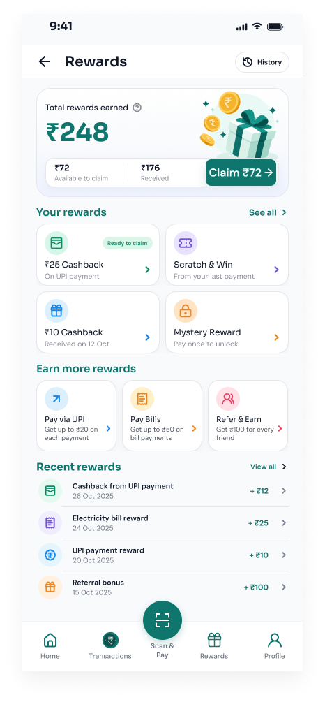
Bringing essential financial information together into a clear, unified dashboard and overview.
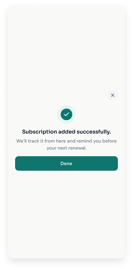
Subscriptions
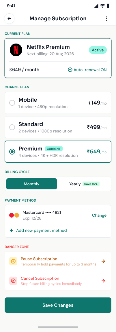
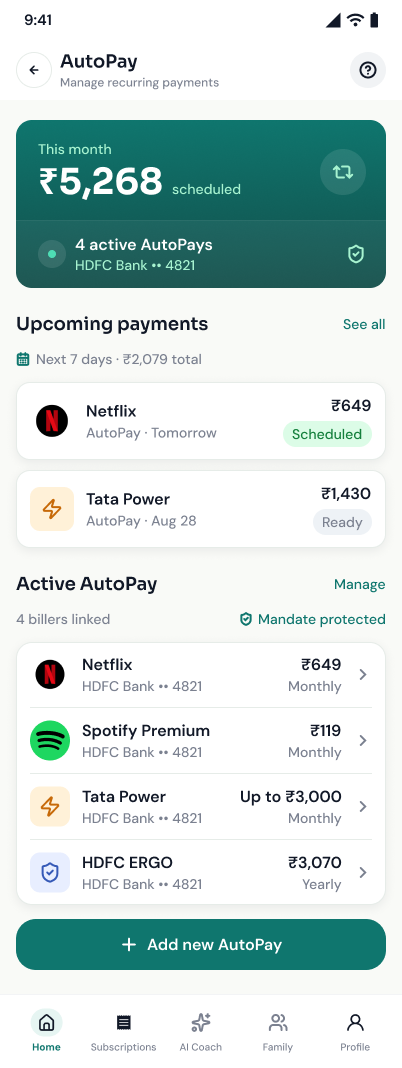
Summarizing recurring costs, managing active services, and easily updating autopay settings.
AI Coach & Advice
Explaining spending changes with actionable insights and interactive, conversational guidance.
Shared Finances
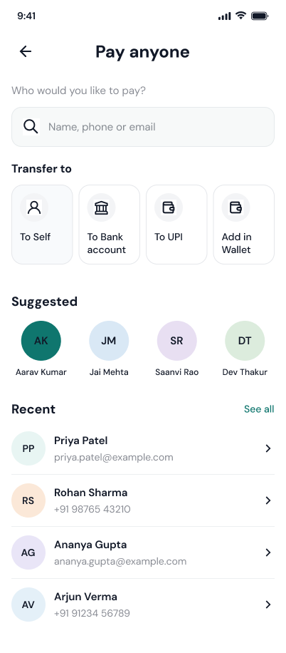
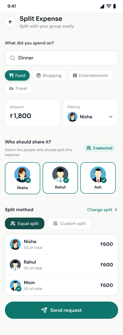
Providing a clear path from intent to outcome, whether splitting an expense or adding to the family wallet.
Clarity over complexity
Showing the essential summary first and revealing more detail progressively keeps the interface approachable, rather than overwhelming the user.
Contextual feedback
Providing clear system status for payment outcomes and understandable insights for spending helps build deep trust in the platform.
Familiar interactions
Reusing known patterns across the app reduces cognitive load, adhering to Hick's Law and making financial actions feel natural.